Saint Luke’s Cottages

Celebrating 60 Years
In 2025, Saint Luke’s Community Living celebrates 60 years of Service!


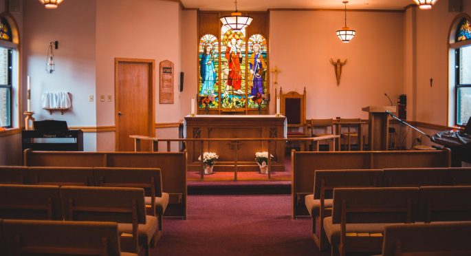
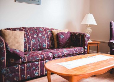
Saint Luke’s Community Living provides long-term care and adult outreach programs at its Saint Luke’s long term care facility, and affordable housing for seniors in its Cottages, Bishop Meaden Manor (apartments and townhouses) and Babb Manor (apartments). Saint Luke’s is a community of care for residents of long term care, tenants of the cottages and apartments, and day program participants. We operate with an emphasis on Christian values, family involvement, and respect and dignity for all. This community was established under the auspices of the Anglican Diocese of Eastern Newfoundland and Labrador (Anglican East NL) and operates in partnership with the Eastern Regional Integrated Health Authority, and with the support of volunteers.
Anglican Homes Incorporated (AHI) will be a leading provider of an affordable continuum of care for seniors in our community.


Cancel